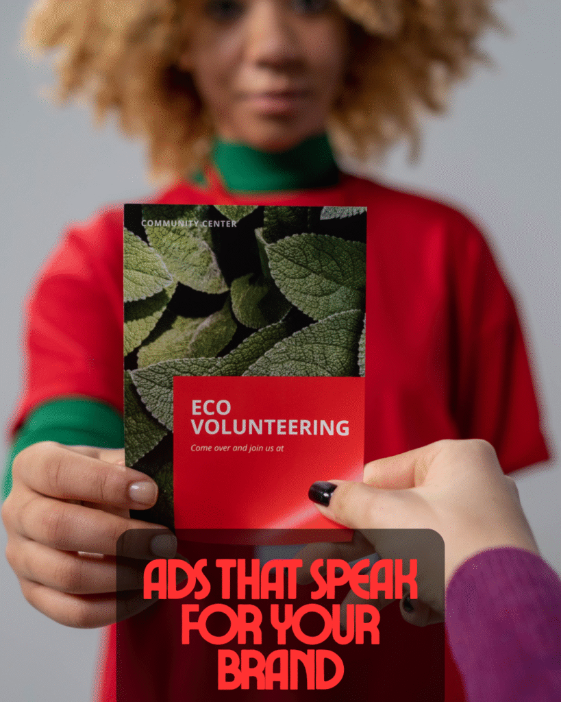
MarkitSA

Graphic Design

Design that does more than look good — it helps your brand get noticed, remembered, and trusted.

At MarkitSA we combine creative thinking with business sense. Whether you’re launching a startup, refreshing your brand, or needing regular marketing assets, our graphic design services give you professional visuals that support real results.

Logo Design

Distinctive logos, colour systems, and brand guidelines that give your business a consistent voice.

Includes 2–3 concepts, 2 rounds of revisions, final files (PNG, JPG, PDF, SVG).

LOGO DESIGN

Social Media Graphics

Ready-to-post templates, carousel designs and reel covers that keep your feed cohesive and engaging.

Flyers, Posters & Brochures

Custom marketing materials that attract attention and drive engagement.

OUR WORK

Trinity & Co Logo

Trinity & Co NPO Logo 

The logo features four colorful puzzle pieces symbolizing unity, collaboration, and diversity—core values of Trinity & Co’s mission to uplift communities. Each color represents a key emotional and strategic pillar:

  • Blue for trust

  • Pink for compassion

  • Green for growth

  • Yellow for hope

Markitsa chose this design to visually reflect the tagline “Giving Hope to the Hopeless”—a brand built on connection, empowerment, and lasting impact. The clean typography and balanced layout ensure clarity and professionalism across all platforms.


Service Monster VA Logo 

The logo features a bold, stylized female figure with green skin and purple hair, holding a shield—symbolizing empowerment, protection, and futuristic service. This central character reflects Service Monster VA’s mission to champion strength, identity, and resilience in virtual assistance.

Each visual element reinforces key brand values:

  • Green for vitality and innovation

  • Purple for wisdom and individuality

  • Pink for compassion and approachability

  • Shield for reliability and defense

Markitsa crafted this design to embody the tagline “Service” with flair and emotional depth—blending retro-futuristic aesthetics with a strong narrative presence. The clean typography and dynamic composition ensure the logo stands out across digital platforms and merchandise, while maintaining clarity and impact.

sex me up logo

Sex Me Up Logo 

The logo features a bold, stylized female figure dressed in a red devil-inspired outfit with horns—symbolizing seduction, confidence, and playful rebellion. This central character reflects Sex Me Up’s mission to celebrate empowered sensuality and unapologetic self-expression.

Each visual element reinforces key brand values:

Red for passion and intensity Black for mystery and allure White for clarity and contrast Horns for boldness and provocative charm

Markitsa crafted this design to embody the tagline “Sex Me Up” with visual impact and emotional edge,blending pop-fantasy aesthetics with a confident, narrative-driven presence. The striking typography and high-contrast composition ensure the logo commands attention across merchandise and digital platforms, while maintaining clarity and brand cohesion.

Maths Academy Logo

🎓 Maths Academy SA Logo Project Overview

The Maths Academy SA logo embodies excellence, ambition, and educational growth. The design combines bold typography with strong visual symbolism — representing structure, achievement, and the pursuit of knowledge.

Each design element reinforces the academy’s core message:

🔵 Blue signifies trust, intelligence, and academic integrity.
🟡 Yellow/Gold conveys success, optimism, and inspiration.
White adds clarity, precision, and balance — key qualities in mathematics.
🎓 The graduation cap stands as a universal symbol of learning and accomplishment, while the dynamic arc captures motion, progress, and upward growth.

Markitsa designed this logo to reflect Maths Academy SA’s mission — to empower students to reach their full potential through quality education, dedication, and confidence-building.

The bold “A/M” icon structure not only creates a recognizable mark but also subtly represents ascension — climbing toward academic excellence. The logo’s modern, minimal aesthetic ensures it stands out across all platforms, from school materials and signage to apparel and digital branding.

The result is a professional, motivational, and future-focused identity that truly captures what Maths Academy SA stands for: building brighter minds, one equation at a time.